


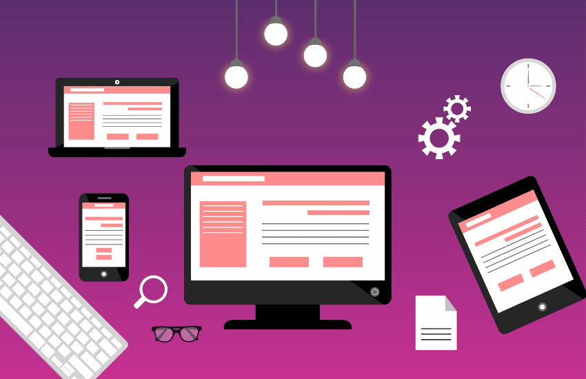
A well-designed website menu can make a day-night difference when it comes to user experience.
When people can find what they’re looking for quickly on your website, they’re more likely to stay longer and remember your brand.
Your navigational menu isn’t the only factor to consider for user experience, but it is a pretty big one that people will see instantly as soon as they click through to your site.
Optimizing your website design means making your website more accessible and friendlier to everyone that sees it.
Today we will be diving into a few different variations of website navigation to give you a better idea of the best options available out there for you to utilize.
What Is Website Navigation?

Think of website navigation as a map, similar to what you use on a road trip that guides you from point A to B.
Website navigation can take on many different forms, but their job is always the same.
The first purpose of website navigation is to help your website visitors find exactly what they need quickly without thinking about it.
The second purpose of website navigation is to support your brand’s image.
It may seem subtle, but your menus either support your overall website experience or bring it down.
Why Is Navigation Important On A Website?

Navigation is important on a website because Everyone that clicks on your website and can’t find their way around it is most likely to leave you for the competition one link below yours.
Now it may not seem that drastic, but in all reality, that’s what happens.
When people start getting frustrated because they can’t find something, instead of spending more time getting a better understanding of the website layout, they leave, and that’s that.
When too many people start leaving because they are frustrated and don’t know how to find what they’re looking for, your bounce rate goes up (percentage of people leaving your website), and Google starts to indicate that your website is no longer relevant for searchers.
Think about it, with Google sending fewer people to your website, business will slow down until the point you realize that there is an actual problem you need to fix.
Try looking at it from your customers’ perspective.
If you were in their shoes and came across a difficult website to navigate and find the information you are after, how would you feel?
Would it make you want to come back to the website?
Would you want to stay and tough it out?
Or would you find another option?
Look, the main point we are trying to make is that it’s essential to spend time on your website navigation.
Make the decision as easy as possible for someone to want to stay on your website and continue browsing through the topics they’re interested in.
1. Standard Horizontal Menu
Standard horizontal menus are the most common navigational menu that you will see most websites equipped with.
Usually, they will comprise of 4-6 main topic links and a few drop-down menus to display subcategories within those topics.
You really can’t go wrong with these menus.
They are pretty simple and straight to the point where people understand exactly where they need to go as long as your category descriptions are on point.
When designing these menus, you can either have icons that represent the sections or just regular text.
Word of advice, though, don’t get fancy here; make it simple, so your visitors don’t get confused.
Lead people exactly where they need to go to achieve their ultimate goal.
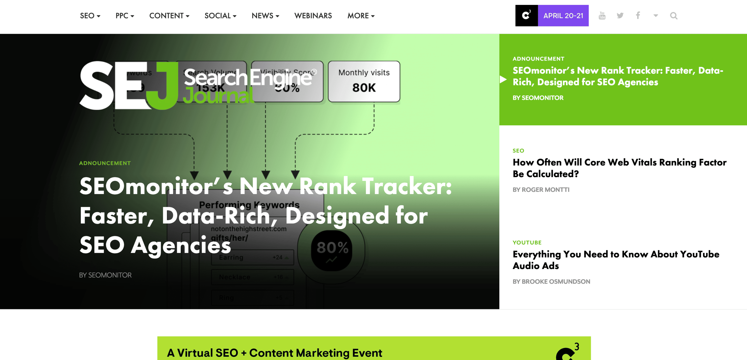
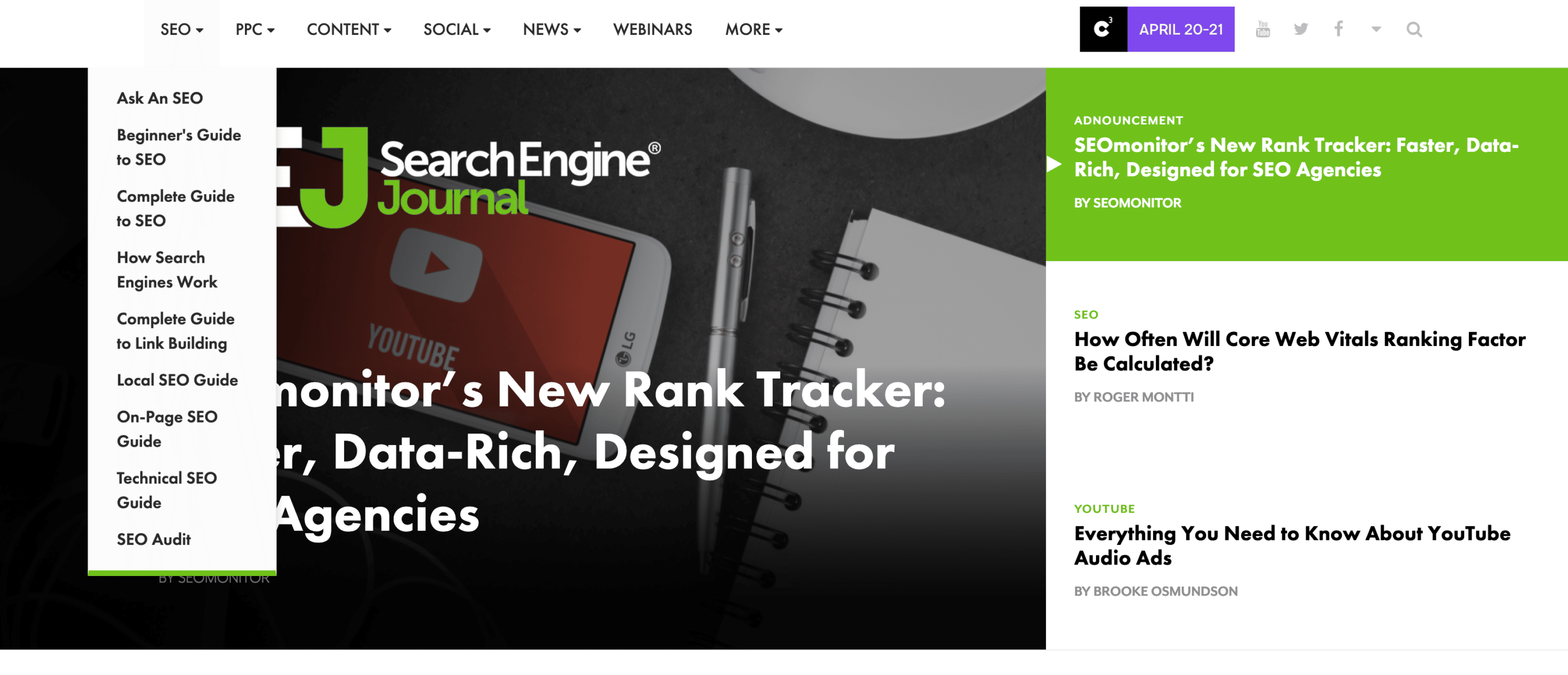
Source: Search Engine Journal
2. Hamburger Menu
Hamburger menus have become relatively famous for the aesthetic design of websites and mobile responsive sites.
It’s a way to get your menu out of the way, and for most people, the universal hamburger-looking sign signals the navigational menu.
This menu style is represented with three lines, either vertically or horizontally.
All you have to do is click on the three lines representing the menu to open the menu; this will signal that you’re looking to see the page options available.
To close the menu, all you have to do is either hit the x icon that appears next to the menu or click the page onto the white space.
Mobile responsive websites generally use this style menu because it’s Compact, and most people understand what it means.
It offers a way not to overcrowd your pages, seeing that phones don’t have too much room to work with as far as screen width.

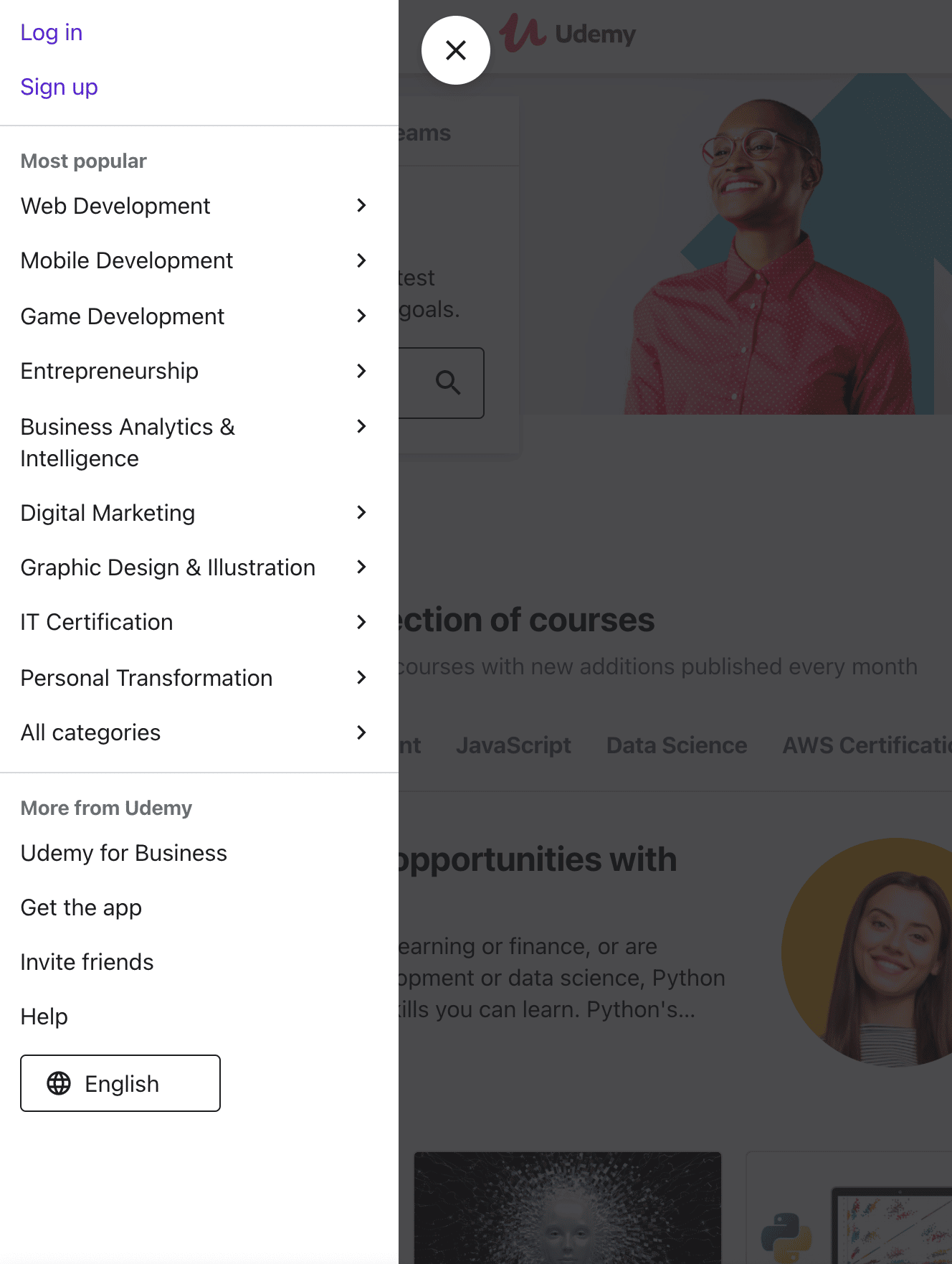
Source: Udemy
3. Mega Menu
As the name suggests, this menu style is meant for larger sites that offer many services and have a wide variety of service categories.
Mega menus aren’t a standard go-to unless it is for a well-established business that can maintain the balance between overwhelming and helpful.
If you are a small business, you are better off simplifying and condensing down to a more management page structure to avoid customer confusion.
Like we said above, when your website visitors start to feel overwhelmed or confused about how to navigate around to the pages they want to see, they will inevitably click off and consult with one of your competitors.
But when pulled off correctly, the mega menu becomes more of a helpful tool people don’t mind using.
Webfx is an excellent example of a well-laid-out menu that does a perfect job at staying congruent with their brand aesthetic design and making it user-friendly to navigate through.
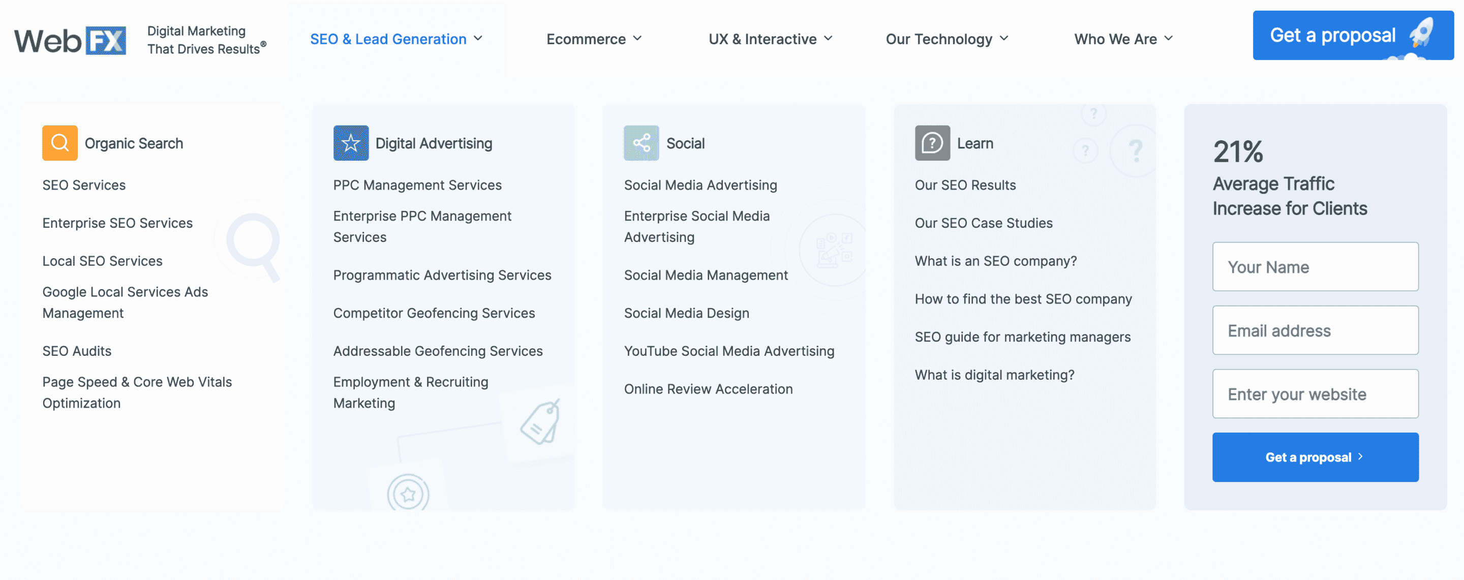
Source: WebFX
4. Scroll Triggered Menu
Scroll-triggered events and menus are becoming more and more popular and with good reason.
They catch the viewer’s eyes quickly and keep their attention captivated throughout the entirety of the on-screen performance.
As the name implies, the events take place as soon as you start scrolling down the page.
If you’ve ever been to Apples’ website, you’ve seen this first hand.
Most of the presentations they use to showcase their new products are usually through scroll-triggered events on a single landing page.
Take some time to go and check out their landing page for the iPhone 12 pro if you haven’t already; it’s a fantastic and engaging experience.
When pulled off correctly, it can be very effective in keeping user attention and keeping them on the site longer.
On the flip side of that, when there’s too much going on, it can almost be overkill to drive people away.
Too much of a good thing is no longer a good thing.
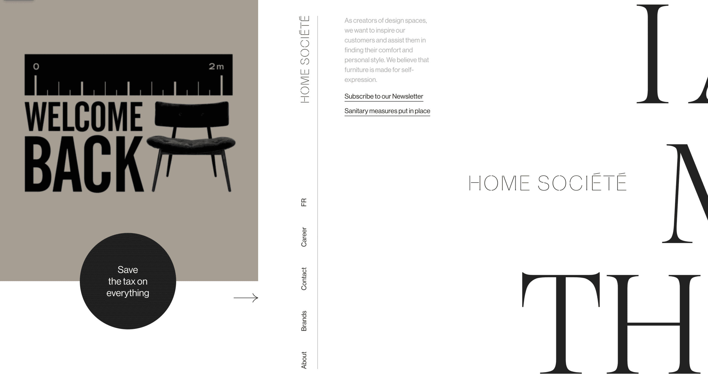

Source: Home Societe
5. Vertical Sidebar Menu
Vertical sidebar menus are similar to The Standard horizontal menu except that it is placed on the side of a website rather than the top.
It takes a lot more space than a traditional top-of-screen menu and, for the most part, has been ruled out as a feasible option because it wastes precious space on the page in most cases.
Sometimes it can be pulled off on media-driven websites that have fewer pages to offer or when there are fewer categories to choose from.
For the most part, though, it is overkill, and we wouldn’t recommend most people using them.
Unless you are a pro designer that can pull it off and utilize less space to pull it off, stick to the basics and expand from there.
Source: Qodeinteractive
6. Hover Activated Menu
Hover-activated menus are similar in style to the hamburger menu, where it hides page options that are available until it is clicked on or hovered over.
This menu style is good at keeping a continuous flow in the aesthetic design if your brand calls for it.
The central concept behind the hover-activated menu is that you’re giving people the option to explore at their own will and enticing them to continue interacting with your site.
If people can’t get enough information from the landing page that they are on then, they have the option to click through to the hover menu for more options.
Think of it as a fancier version of the hamburger menu.
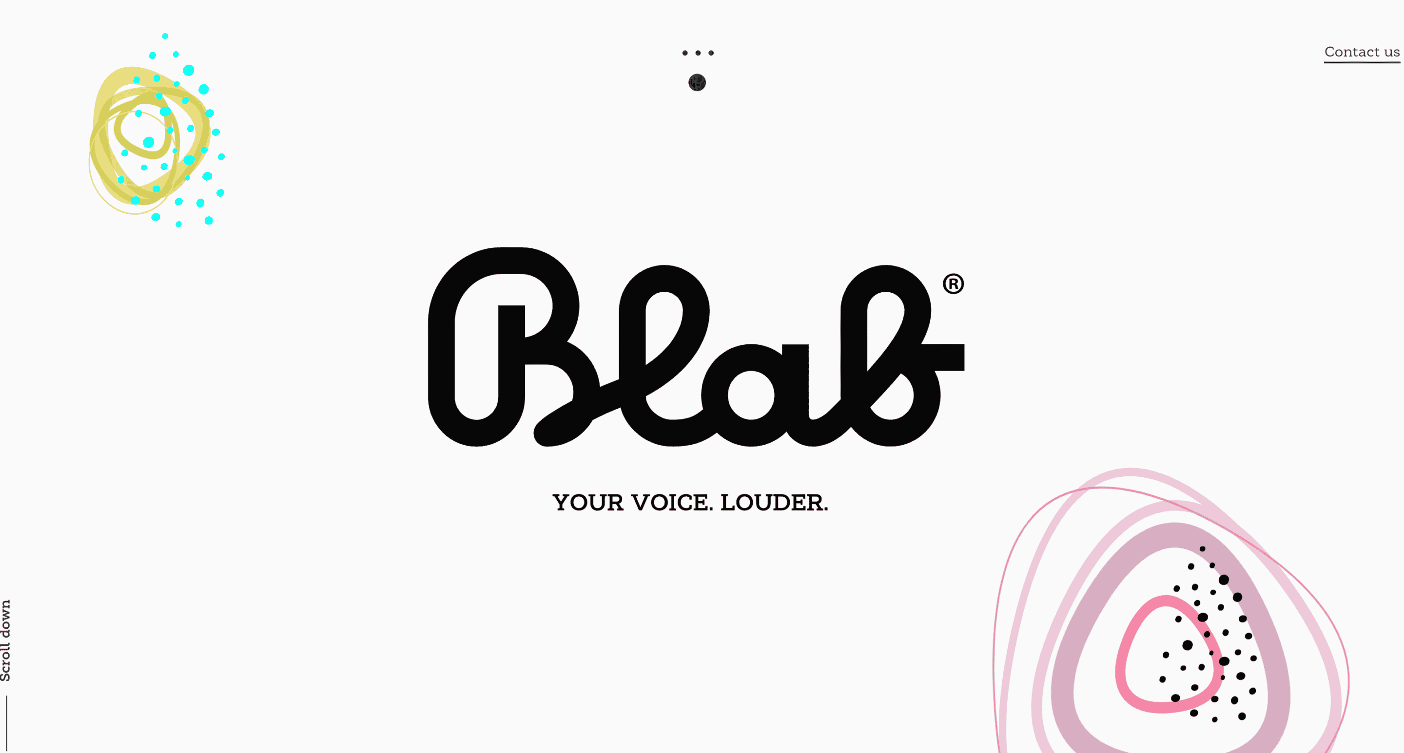
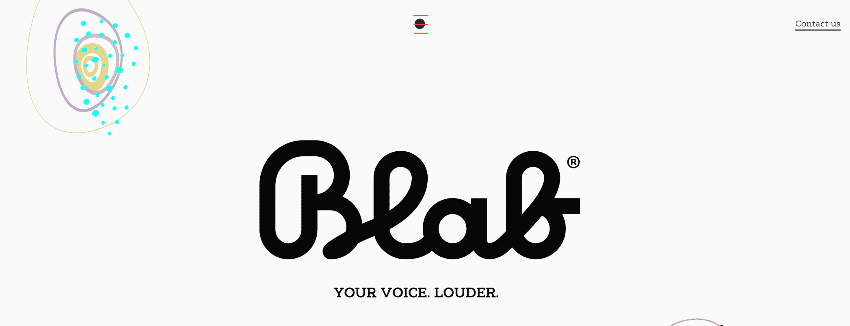

Source: Blab
7. Sticky Menu
Sticky menus are designed to stay with your visitors for the entire duration of their website interaction.
If the visitor scrolls down, it’ll accompany them for the journey.
Guess what happens when they scroll back up?
It gives your website users a sense that they get to control the experience they are having throughout their time spent on your site.
It helps people choose the path they want to take, whether that means to check out other blog content you offer or product pages to see what you sell.
Sticky menus keep the thought in your visitors heads that they can jump around whenever and wherever they choose.
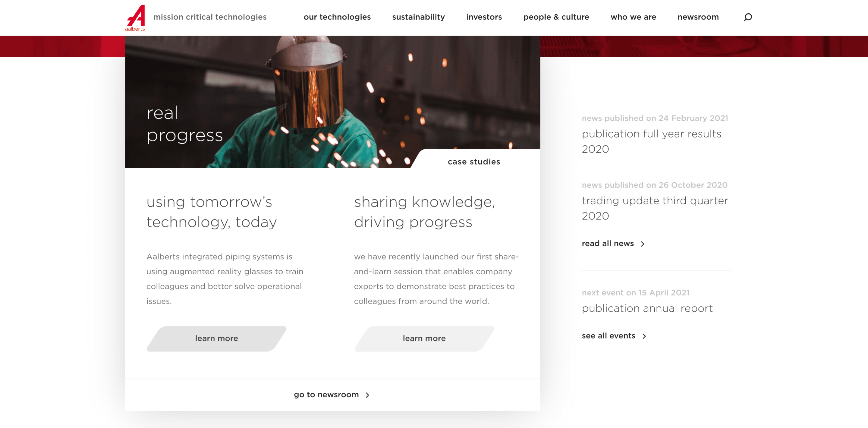
Source: Aalberts
Conclusion
Navigation on your website is a critical component of how people interact with and use it.
The critical component in your brand’s image online and the experience that your website visitors can expect to have can be affected by your navigational menu.
Be the business that makes their browsing experience enjoyable and straightforward.
In the long run, it will prove beneficial to your users and your customer conversion rate.
Thank you for hanging out with us today; as always, we appreciate you!
If you enjoyed this article and would like updates when we drop more just like it, subscribe to our email newsletter below!


0 Comments