


Having a website for your business is only the beginning when it comes to succeeding online.
Think about it as the first stretch in a cross-country road trip.
That moment where you are enjoying the feeling of being free from any strings or worries that you have to be doing something else.
All you are focused on is the road and the music that makes the experience seem like a movie.
You have it all planned out; you will sleep in your car and eat trail mix the whole way to your destination.
Then after a few days, your back expresses to you how much it enjoyed this plan by sending sharp pains up and down your body and informing you that your rear seat isn’t as comfortable as you were letting on in your head early on.
So, you brainstorm a solution to your problem and conclude that spending a night in a hotel and eating a nice meal sounds like a wonderful upgrade compared to laying on your rear seat, which feels more like a brick now, and eating trail mix endlessly to satisfy the craving of hunger.
Think of web design like an upgrade from sleeping in your back seat and surviving off of trail mix for a road trip to eating a nice meal and sleeping in a more comfortable bed.
By taking the time to upgrade your trip experience, you are more likely to get back to enjoying your time on the road rather than dreading it.
Who knows, you may even volunteer for another adventure in the future because of it?
Okay, that’s enough analogies for one day.
The point is that web design can significantly increase your website’s functionality and provide your visitors with a better user experience.
Today we will be going over 17 actionable tips for web design that will help you improve your website experience and increase the likelihood of more repeat users.
Table Of Contents
1. Use Descriptive, Clear Headlines On Your Homepage
2. Keep The Conversation Going And Give Customers Room To Scroll
3. Simplify The Decision-Making Process On Your Site
4. Don’t Over Complicate It; Keep Your Pages Free Of Clutter
5. Take The Guesswork Out Of Using Your Site, Be Predictable
6. Use Visual Cues And Nudges As An Advantage
7. Make Your Site More Personable And Show You Are Human
8. Show Your Team And Real People Behind The Screen
9. Take Advantage Of Visual Hierarchy
10. Utilize Color To Bring Visitors’ Attention To Take Action
11. Don’t Disrupt Action Steps With Misplaced Links
12. Keep Written Content Easy To Digest And Soft On The Eyes
13. Write Subheadings Filled With Meaning And Substance
14. Avoid Industry Jargon Your Visitors Wouldn’t Understand Or Break It Down
15. Answer The Questions Your Customers Are There For
Website Usability
1. Use Descriptive, Clear Headlines On Your Homepage

Use your headlines effectively.
Most of the time, people like to use their on-page real estate for generic phrases and terms that are unhelpful.
Ensure that headlines clarify for the user right away that they are in the right place for the answer or solution they are looking for.
According to the Nielsen Norman Group, viewers typically leave a website within 10 to 20 seconds.
This means that the first initial introduction is critical and shouldn’t be wasted.
Aim to make your purpose and what you have to offer very clear from the beginning and use power words to reinforce your heading.
Use your headlines as valuable guides, allowing the end-user to reach their destination without a scratch.
Check out these examples to help you get some inspiration:
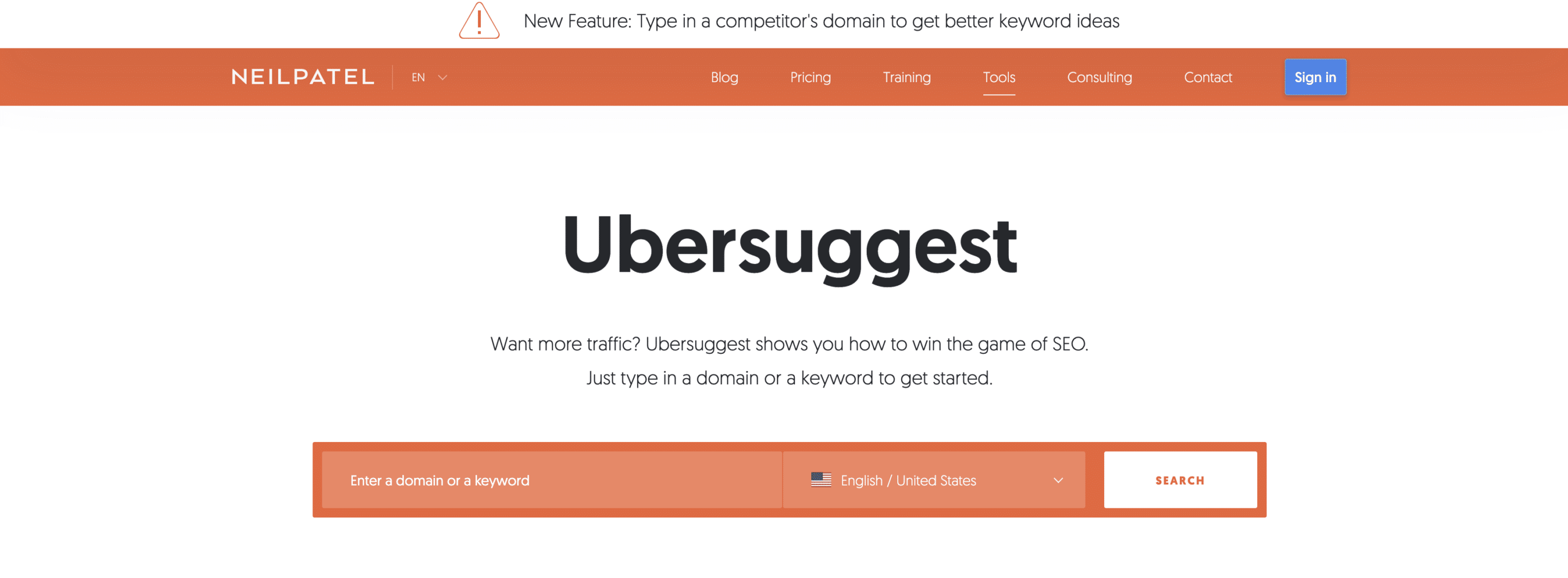
Image Source: Ubersuggest
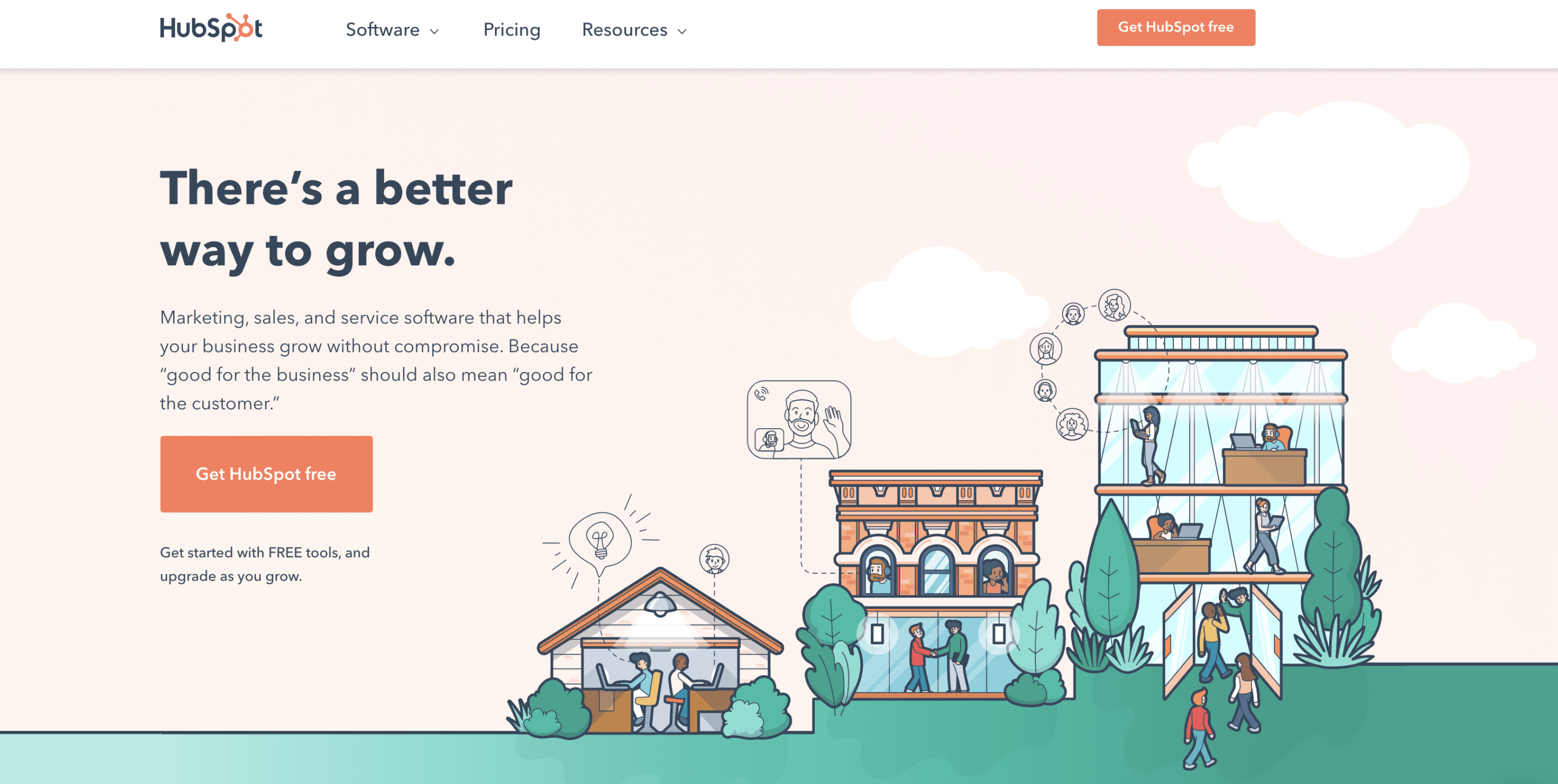
Image Source: Hubspot
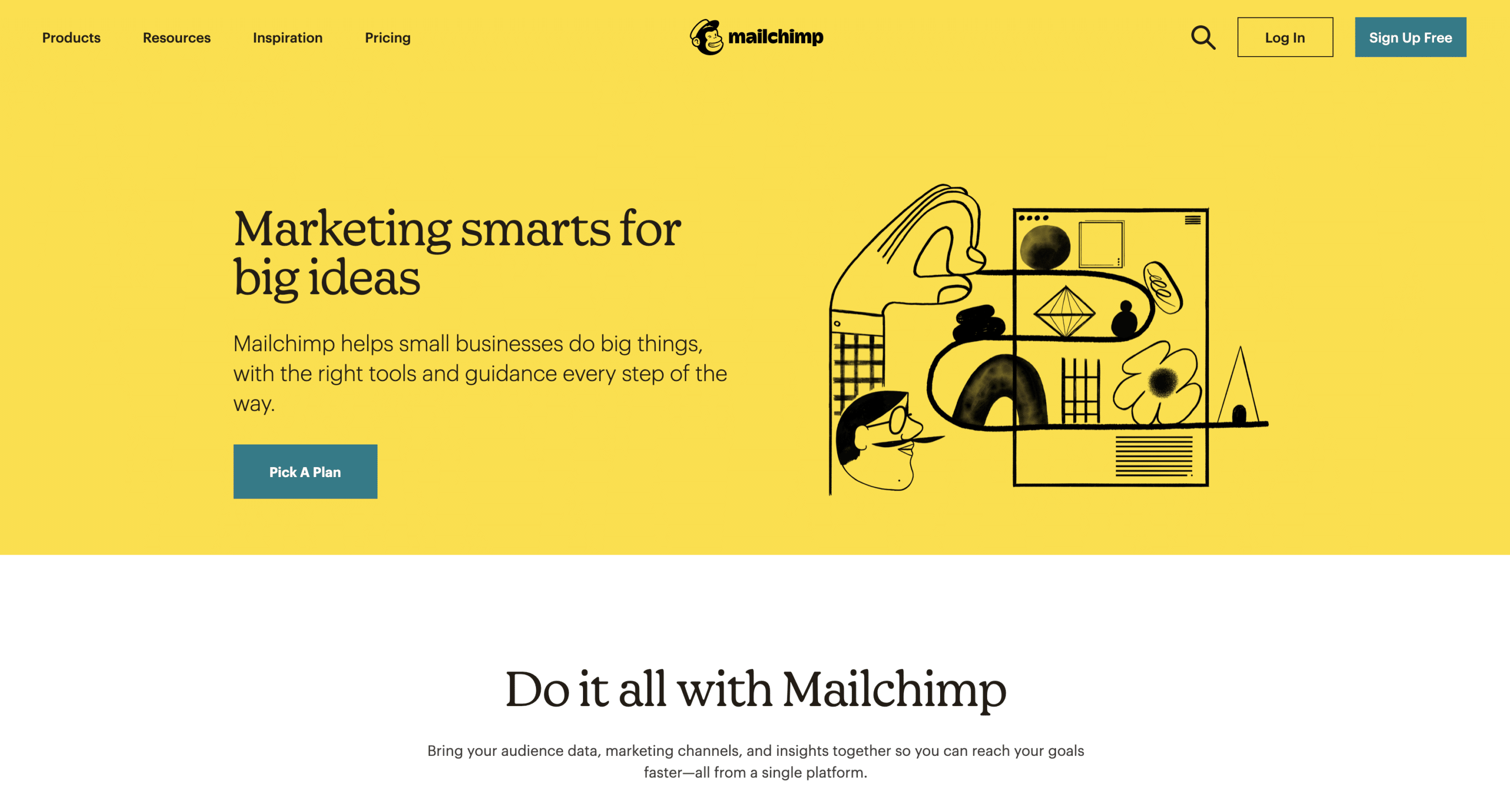
Image Source: MailChimp
2. Keep The Conversation Going And Give Customers Room To Scroll

When people are coming to your website for the first time, they aren’t always ready to act right away by clicking on buttons or links.
You want to help your visitors feel warmed up to the idea that you have what they need, and it’s worth their time to look further into it and eventually perform the action you are working to help them take.
Think about the pages of your website as an airplane landing strip rather than a helicopter landing pad.
Planes need time and space to gain enough momentum to thrust themselves into the air and achieve their flight goal.
Use your pages to help your visitors warm up to your site until they are ready to take action and get closer to the result.
This applies to all of your pages, not just your homepage; take up space you need on the page to answer any questions that may be holding them up from taking action.
Showcase your brand values, snippets from your blog or learning resources, or social proof and case studies.
Make sure the information that they are after is accessible and easy to find.
Check out Slack; their website is an excellent example. Watch the video scroll through of their homepage below our check it out on your own:
Source: Slack
3. Simplify The Decision-Making Process On Your Site

Sometimes too many options are not always the best solution.
This applies both to products and navigational options on your website.
This can be easily overcome for products by providing search filters for visitors to work through and see the products they are after.
When it comes to menu options that you provide your visitors, try not to overwhelm and complicate the process.
When people get frustrated trying to find something on your website, they clicked off and find another site that can do the job with less headache.
Make it simple for people not to have to think about what they’re trying to do.
Whittle down your menu items to the things that are crucial to being there.
Then think about how you can squeeze everything down into a bite-size drop-down menu or get rid of it altogether if it doesn’t add value to your users.
Try to make the decision as easy as possible and embrace Hick’s law, Which states that the more choices the individual has, the longer they will take to make a decision.
The longer someone takes to decide, they are less likely to make a decision and take action.
Simplify this mental battle that your customers will have to go through when you provide them with too many options.
A real-life example of this is a study conducted in a supermarket where people were given less variety of jam to try on one side of the table, and the other side of the table showed more choices.
The side of the table that had fewer options had a 27% higher chance of someone buying that product upon their visit to the store.
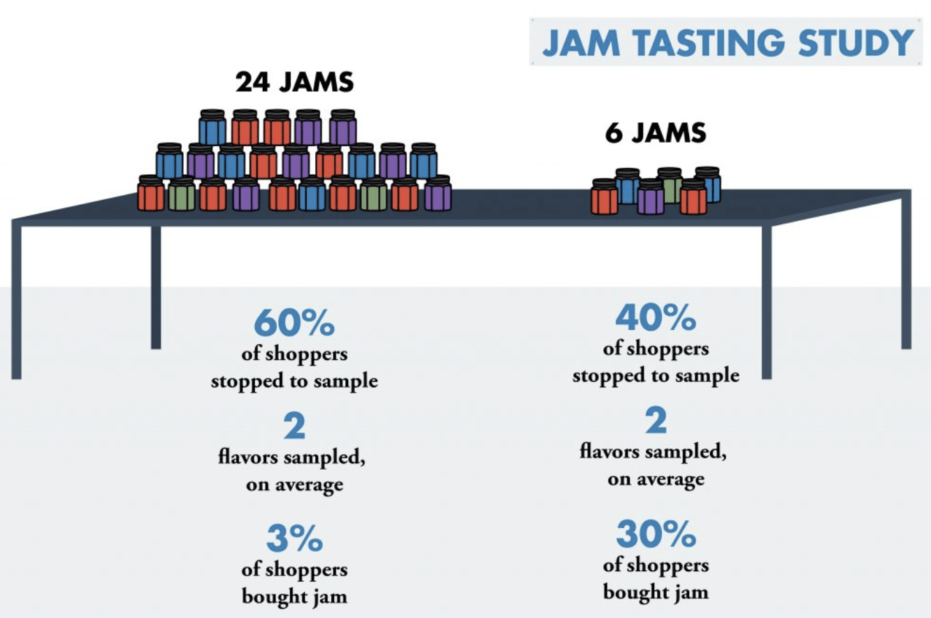
Image Source: Cartstock
4. Don’t Overcomplicate It; Keep Your Pages Free Of Clutter

No one likes clutter in real life, and the same thing goes for online.
When websites are cluttered and full of unnecessary words and links filling up the page, you don’t know where to turn most of the time, and you will likely be left with the feeling of being overwhelmed.
The odds are that more visitors will leave the website than stay with little chance of returning.
If you were to look at many popular businesses’ websites, you notice that there is a decent amount of white space in between text, pictures, and buttons.
There’s a simple reason for that.
It helps people stay focused on the initial goal they made originally when they stumbled onto your website.
Google did a study to try and get to the bottom of what websites people found attractive and what ones were perceived as not.
The results showed that the more complicated the design was, meaning that visitors would interpret the website as less appealing and attractive if there were too much of anything visually happening.
The less complex the websites were, the more attractive they were in the user’s eyes.
A lesson to take away here is to keep things simple and think about your website’s flow.
Ask the people who actively use your website and see what they think about the layout and experience.
If you get many people saying that it’s too hard to use and makes them feel uncomfortable, it’s time to declutter and simplify.
5. Take The Guesswork Out Of Using Your Site, Be Predictable

Your first instinct when designing a website will be to stand out and be “edgy,” making it seem like you are different from your competitors.
Avoid this instinct at all costs.
Do what is already working, and don’t reinvent the wheel.
I know that there’s a little voice in the back of your head saying that you have to stand out, but in all reality, you want to be predictable in terms of your website’s usability.
You want people to instinctively know where they need to go to find what they’re looking for.
Stand out with your message, not your layout.
Let your message tell your visitor why your business is better than the rest and help them resonate with your overall mission.
Think about how you can condense similar pages and get rid of irrelevant ones.
We aren’t saying that you shouldn’t have many pages on a website; over time, your site will continue to grow, and your business expands.
But work on giving people only what they need and make the decision easy; natural almost.
check out HubSpot’s menu options from their home page:
Image Source: Hubspot
6. Use Visual Cues And Nudges As An Advantage

The whole point of web design is to guide people through your website and get them to take action, whether making a purchase or filling in a form.
Creating visual cues is the equivalent to someone pointing out the window at something and saying, “oh wow, look over there!”
It doesn’t have to be with words but the layout of the content on the page and incentive signals pointing towards where you want them to go.
Conversionxl studied this concept to see how people reacted to different visual clues nudging them towards filling in a web form.
The study demonstrated that guiding visitors and holding their hand to walk them towards the form location increased lead generations significantly.
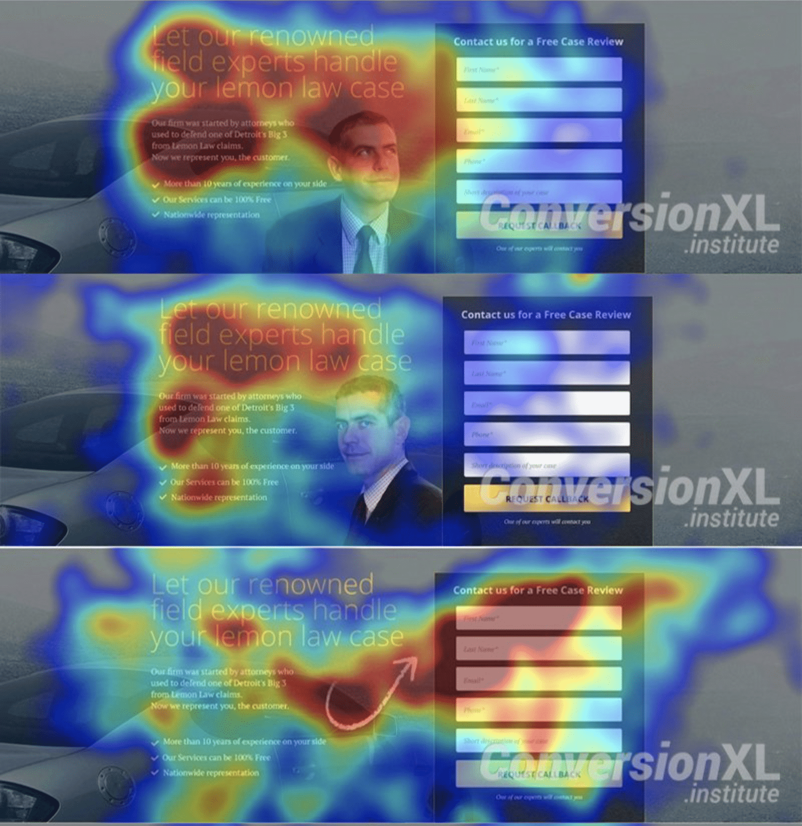
The thing to take away from this is to think about giving more visual clues toward the desired result you wish for them to take.
7. Make Your Site More Personable And Show You Are Human

People enjoy being around other people and talking to people who can relate with.
Being around people just like them lowers mental and social barriers.
By incorporating a more personal attribute to your company, you’re making people feel at ease whenever they interact with your business.
By nature, we experience a sense of calm when we are talking to other humans that can relate to us and our feelings.
When customers can put a name to a face or voice, there is more of an emotional connection through the conversation, and more likely than not, that visitor would feel comfortable purchasing your product.
Consider writing bios about yourself and your team on your about page, along with a presentable picture.
People love doing business with other people, not big companies.
8. Show Your Team And Real People Behind The Screen Instead Of Stock Photos

Like we said in the last point, people love doing business with people, not big companies.
This also applies to the content you create within your site.
Most users are pretty good when it comes to detective work and telling which photos are stock photos and which ones are not.
Studies show that most website visitors will skip over pictures and ignore them as soon as they get a slight hint that your photos are stock photos, not real people.
Try to incorporate more pictures of your team actively working and taking care of their client work.
Have a repository of team photos that you can use whenever you need to do so throughout your content.
It helps with engagement throughout your site, and your viewers will love it.
9. Take Advantage Of Visual Hierarchy

If you were to look at any large organization’s website that spends a decent amount of the revenue on web design and understanding what drives user engagement, you would notice a hierarchy between the aspects you see on their pages.
Check out WP rocket for example:
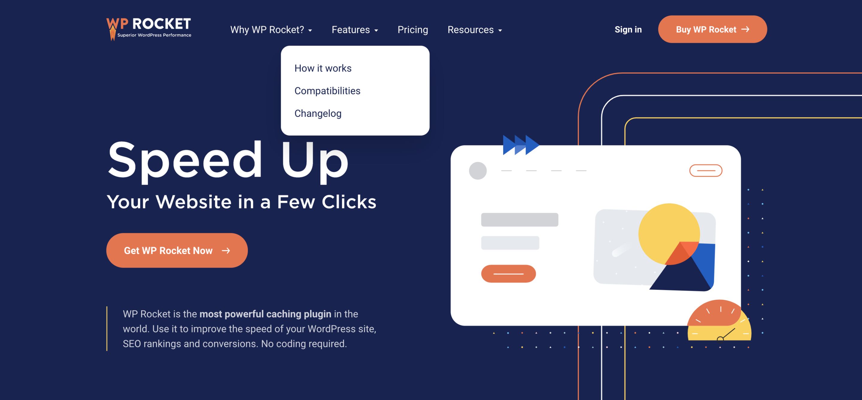
Image Source: WP Rocket
They have elements on the page ranging from large, medium, and small, making it super clear what they are trying to get you to do on their website.
There’s a solid reason why the button is positioned the way it is, and it is the size that it is along with the background color making words pop off the page at you.
As another example, check out WordStream:
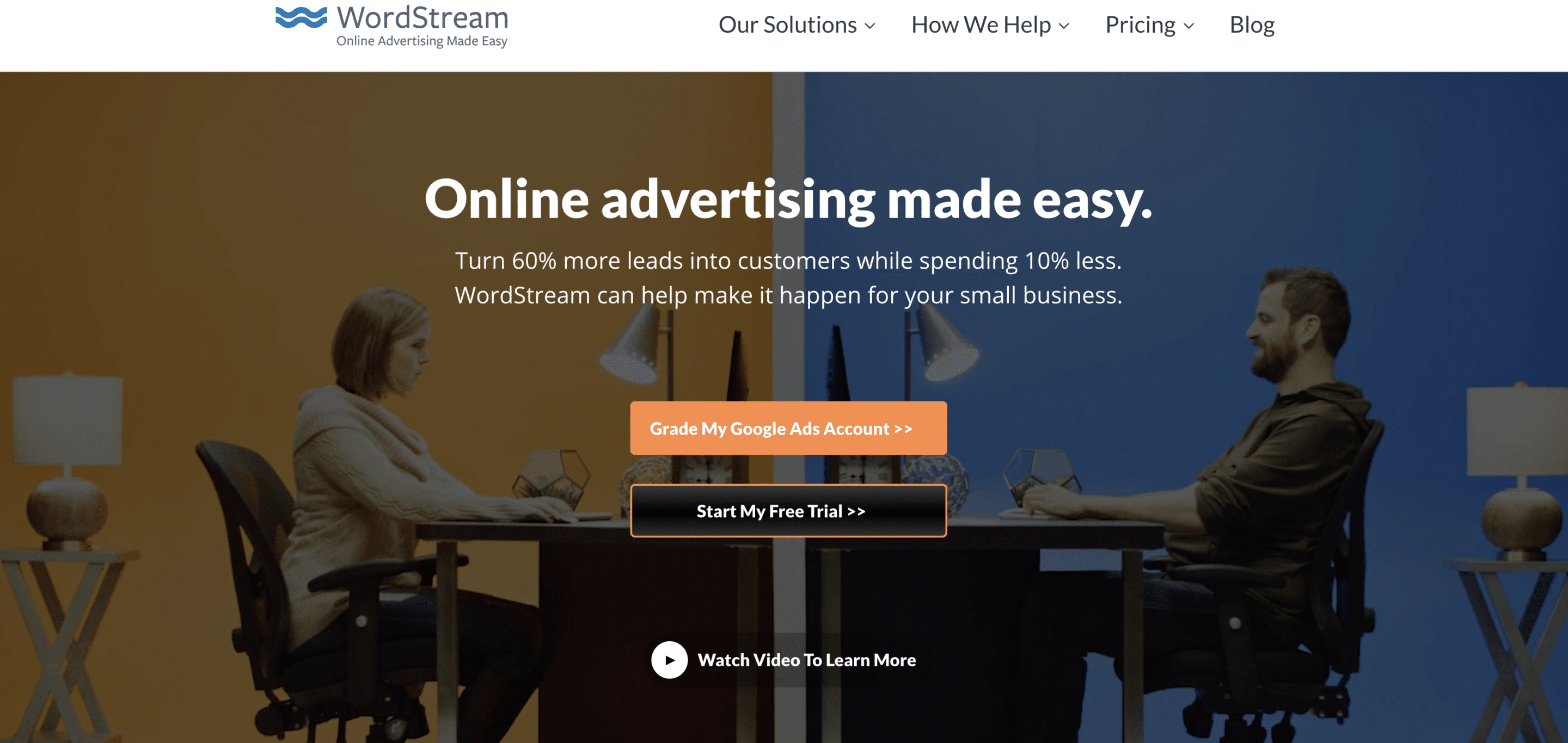
Image Source: WordStream
The call-to-action is prominent, and there is a clear distinction between what is essential to read on the page and what is just there for description.
Everything is placed on the screen with a purpose.
Try to incorporate this theme within your site’s pages and make it as clear and concise as possible.
Make the important things large, the description stuff that is a less important medium in size, and the least important as small.
10. Utilize Color To Bring Visitors’ Attention To Take Action

Take advantage of contrasting colors to define the call to action on each page that your visitors land on and utilize.
This can be done simply by changing the color of a button to something that pops on a white background or whatever contrasts against the ground.
Make it something that will quickly grab visitors’ attention and help them naturally gravitate towards the outcome you wish they took.
Keep things in line with your brand colors, so nothing is too off-putting, and make sure it is the center of attention as soon as someone comes on the page.
11. Don’t Disrupt Action Steps With Misplaced Links

This one will hurt your sales in the long run and will most likely leave you feeling a little bit angry knowing that you were sending your customer away at the very moment they were about to make a purchase.
Don’t put links on landing pages or anywhere your visitors are prompted to convert into paying customers to take them away from the buying mindset.
Meaning you don’t want to put a link to your blog right before the product page prompts the customer to “buy now.”
Once the visitor clicks off of this landing page to the links that you have instructed them to click on, the likelihood of them buying anything goes down drastically, and you will most likely not be able to get them back in the buying mindset then and there.
Try to keep the focus attention on the end goal you’re after.
Website Written Content
12. Keep Written Content Easy To Digest And Soft On The Eyes

Written content on websites used to be written in huge overwhelming chunks of text that made you want to run in the other direction.
Meaning that people would use giant bricks of paragraph and text walls, hoping that people would read them and value the content page.
Nowadays, if someone has to work extra hard to consume the information you’re trying to present, the likelihood of them reading it is slight to none.
Aim to make the reading material as easy to digest and skim as possible for the best outcome possible.
Break it up into smaller chunks that are easily distinguishable so people can find what they’re looking for fast and move on.
The goal is not to bore your visitor to death; it is to educate them and help them along their Journey towards ultimately finding their answers and make a purchase.
13. Write Subheadings Filled With Meaning And Substance

Don’t misuse the space available to you for getting your message clearly in front of Your ideal customer.
Use subheadings to define and describe exactly what it is that your visitors are going to gain from whatever is to come.
For example, if you have “products” as a navigation link on your website and sell only a specific set of products, think of a better way to label that navigation link so that people don’t second-guess in checking out the other pages.
You are using the space that you have efficiently and effectively to Greaten people’s chances of clicking through and staying on your website longer because you seem more transparent and helpful.
14. Avoid Industry Jargon Your visitors Wouldn’t Understand Or Break It Down
Regular people have no idea what you’re talking about when you start breaking out your industry’s jargon as if you’re talking to a colleague or friends with similar interests.
Try to avoid using words that most people in your audience wouldn’t know what you’re saying.
Break it down and make it easy for anyone to learn about the subject your writing about to interpret it.
If no one can understand what you’re trying to say, they will most likely not pay attention.
The person who can break down complex subjects the best usually wins visitors’ attention and respect.
You always know who the most intelligent person in the room is by how they make complicated topics seem as if it’s first-grade math.
They break it down in a way that anyone and everyone can digest, which in turn has the most value to everyone around them.
If you ever are forced to use your industry’s terminology and jargon within an explanation, take a minute to break down exactly what you’re trying to say and define the words that you know people won’t understand; Do it out of respect for your reader.
15. Answer The Questions Your Customers Are There For
Visitors click on your website for a reason; they are there to seek answers to the problems that they haven’t found answers to quite yet.
Your job is to communicate the answer to the problems they’re clicking on your website to learn more about ( your field of expertise ).
Use your industry knowledge to educate people that are less familiar with the topics spoken about.
After doing so, you will gain respect in the reader’s eyes and most likely earned a few points toward them remembering your brand based on the value you provided.
This usually leads to them coming back to your website and becoming part of your tribe or community of raving fans.
16. Provide Some Social Proof
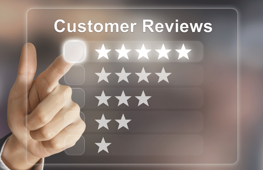
Social proof is a big deal.
It’s a way for the world to see what businesses have the reputation of performing well and those that don’t.
When you go to Amazon to purchase a new gaming headset, you would probably be checking out the review section of the page to see how others’ experiences were with that product before purchasing.
No one likes being the first to a party, and no one likes having a bad experience when purchasing something online or in person.
Social proof can go by many different forms, such as:
- Case studies
- Testimonials
- Reviews,
- Social media following
- Trust icons (recognition from larger businesses)
Social proof helps visitors build trust with your brand a lot quicker than without.
When there is social proof that your business is the real deal, there will naturally be less resistance in the relationship’s buying phase.
If you don’t currently have any reviews or social proof, try reaching out to past customers and see how their experience was the last time they purchased your product.
Ask them if they would be interested in writing a review in return for a $10 gift card.
Not everyone will say yes, but you only need a few to get the ball rolling and start building up momentum.
17. Optimize Email Signup Forms
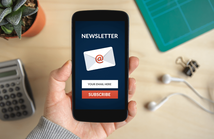
Email is one of the highest return on investments you can implement into your content marketing strategy.
On average, email marketing generates $38 for every $1 spent, a 3800% return.
With numbers like those, it’s a no-brainer to optimize the process of getting people to subscribe to your email marketing list.
You want to make it as easy as possible to supply their contact information without feeling like you are stealing from them.
Here are some simple tips of things you can implement today to help convert more visitors into email subscribers:
- Help your email signup stand out within the visual hierarchy of the page.
- Tell the reader what exactly they will get from signing up and how often.
- Mention how many subscribers you have or display a testimonial as social proof other are doing it too.
Conclusion
We covered many actionable tips within this article today, and I know it can seem a little overwhelming.
To help you get started today, pick just one thing to work on and then slowly work more and more into the equation to improve your overall web design.
Do this until you are satisfied with the results your website is bringing in; Once you have mastered the art of web design, come back to tell us all about what you learned and some results you might have produced in doing so.
Thank you for hanging out with us today; as always, we appreciate you!
If you enjoyed this article and would like updates when we drop more just like it, subscribe to our email newsletter below!

0 Comments
Trackbacks/Pingbacks