You built this kick-ass website to host all of your excellent content for the world to enjoy and use from anywhere.
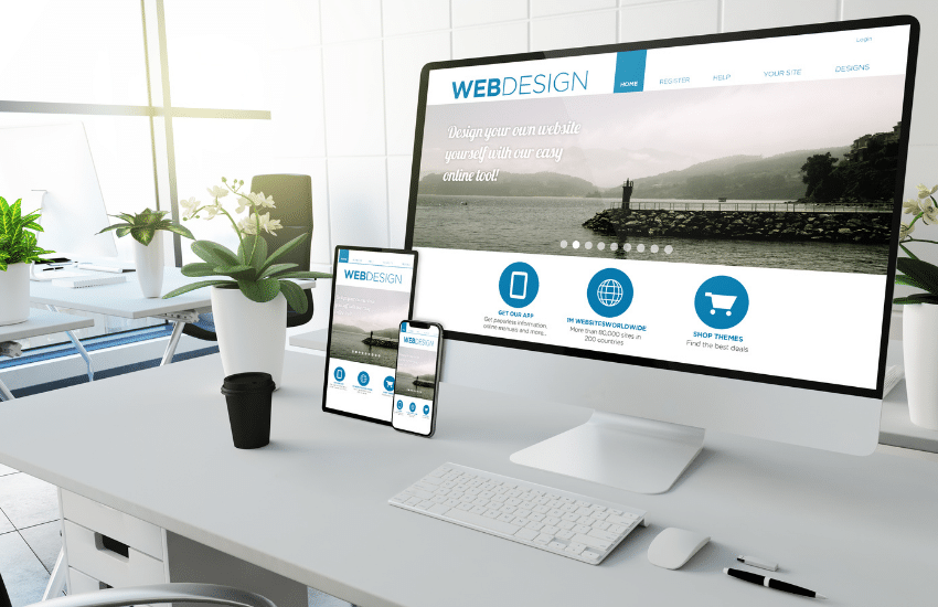
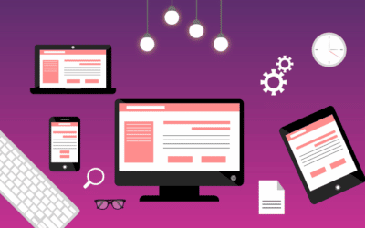
That’s great; just one thing, though, why does it look funky on mobile?
Ahhh, you forgot that are other devices out there that people use to enjoy their favorite content on?
It looks like it’s back to the drawing board for you!
Hopefully, this situation above is only an example, not first-hand experience.
If you are getting ready to make your first website and are in the research phase of getting things done, this easy breakdown will help you avoid making a costly mistake.
Today we will go over the two main types of web design formats you have available when creating your website, the advantages of each, and wrap it up by helping you decide what the better option is based on your current situation.
What Is Adaptive Web Design?

Adaptive design is where you create multiple versions of each page on your website that will each have their unique format based on the device and screen-sized used to view that page.
Meaning that each device will be served with its very own unique view and format.
When someone uses their phone, everything will be formatted and laid out for people to scroll through and tap on the things they’re trying to find in a visually appealing presentation.
Each device used on your site will use the correct size and format designed for the particular device.
Yes, you will have to develop a version for each of the sizes you wish to accommodate (which should be all available devices).
Usually, the best practice is to pick and choose the most frequently used screen sizes and create accordingly.
The most popular screen resolutions are:
- 320
- 480
- 760
- 960
- 1200
- 1600
Adaptive web design will detect the screen width based on the device width attempting to view your website and provide the version of that page that fits best.
For instance, if you were on desktop, you would be served the adapted page for desktop, not mobile.
The end goal is to make the user experience as seamless and enjoyable as possible, no matter what device is being used.
What Are The Pros Of Adaptive Web Design?

1. It allows you to provide an excellent experience for everyone, no matter the device they prefer
Adaptive web design makes it possible for you to give all users a relevant and happy experience while floating around your site on their desired devices.
2. The ability to achieve faster load time
Web browsers only need to load the specific adaptive design that fits the device being used and skips the rest.
If someone uses their phone, your website only has to load up the mobile-specific version of that page.
3. You to use and recycle parts of your website you already developed and designed.
A lot of your website that is already created (if you have one) can be recycled and used as a baseline for your adaptive design template.
This makes it pleasant for your development team as well as your wallet.
What Are The Cons Of Adaptive Web Design?

1. Can be costly
It takes a lot of back and forth with developers to make this web design possible.
Keep in mind is that they are essentially putting together multiple versions of every page on the website and all of those versions have to be maintained and updated so the workload could add up fast and the bill that follows.
2. Heavy workload and maintenance
Like we said above, maintaining everything can become time-consuming as more and more pages begin to roll out on the website, along with the multiple versions for each page.
If you don’t have a development team actively keeping control of this and helping you with the workload, it will soon overtake you and your time.
What Is Responsive Web Design?

Responsive web is the most commonly used type of web design out there right now.
This is all thanks to how easily accessible it is for people to get into without having backgrounds in web design or development, mainly in part to CMS (content management systems) like WordPress.
Responsive web design takes out most of the extra maintenance you have to perform with adaptive web design.
The main reason is that you don’t have to make multiple different versions of the same page to fit all different screen sizes and resolutions.
You’ll need to make one, and that one version will work for all different devices and adapt to the required width of each device.
Many drag-and-drop website builders for average joe’s to use and mess around with to try and do it themselves.
Most of which you can use in conjunction with platforms like WordPress, or if you’re looking for something more manageable and more simplistic to maintain with less of a learning curve, check out Squarespace Or Shopify.
What Are The Pros Of Responsive Web Design?

1. Easily adapts to any device size with less headache
This means that it looks great on any device used, such as desktops, tablets, smartphones, and even TV screens.
Thankfully, it takes some weight off your shoulder of having to balance everything that you would with adaptive design.
2. It’s cost-efficient for anyone, including small businesses.
It’s more cost-efficient because you only have to make one iteration of your website that works well across every device instead of an adaptive design.
3. Helpful for SEO efforts (search engine optimization)
Responsive design improves the user experience by making everything on your website enjoyable to use and raises visitors’ chances of staying on your site.
The more time your users spend on your site, the more Google will see your site as an excellent match to their users’ inquiries, resulting in a higher ranking on google.
What Is The Con Of Responsive Web Design?

- Loading time increases a decent amount compared to adaptive web design.
This is primarily due to the end-user having to load a larger version of your entire website onto their device.
There are plugins and other ways to speed up your website and loading time, so it usually isn’t a huge issue, just something to note.
Adaptive Vs. Responsive Web Design, What Should You Choose?

The answer to this question depends on where you’re at within your business financially and team size.
Small businesses that are just getting started or don’t have any website traffic should probably stick to responsive web design for simplicity’s sake and less headache.
This will save you a lot of time required to invest in learning about web design and development.
Not saying that you shouldn’t learn these things, but when you’re just getting started, it’s better to get the ball rolling sooner than later or outsource the workload.
You can always go back later on when you have more traffic and more demand on your website, making sense to deliver specific adapted pages.
For businesses that have quite a bit of traffic coming in and they see that load times are slow after experimenting with plugins like wp rocket and would like to enhance specific user experiences based on device, bandwidth, location, and have the financial means of hiring a team out to help maintain any web development and design, adaptive web design could be an option for you.
Both formats and design techniques have the potential to work great for all of your users’ devices.
Just choose what makes the most sense in time and get to work.
Conclusion
Both adaptive and responsive web design Have their advantages and disadvantages.
If you’re just getting started and don’t have the financial resources to implement an adaptive design, then responsive is your go-to.
Your web visitors will appreciate a friendly, easy-to-use website that is form fitting to their devices.
Plus, Google will be more likely to reward your website with higher rankings the more people stay on your website for an extended period of time.
That wraps up our brief discussion on adaptive vs. responsive web design.
Thank you for hanging out with us today; as always, we appreciate you.
If you enjoyed this article and would like updates when we drop more just like it, subscribe to our email newsletter below!


0 Comments