Have you ever been on a website that has zero images and nothing by text?
Like giant, massive walls of the text so intimidatingly large that you don’t know whether to jump through the screen to summit them or turn around and run the other direction?
Sorry to bring up sensitive subjects here; hopefully, the flashbacks weren’t too bad.
If you have ever lived through what was just described above, please know that this is a safe space, and it’s going to be okay.
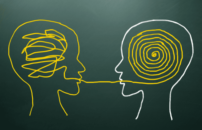
The point we are trying to get to here is that you don’t have to be a kid to enjoy pictures every once in a while with a side of information.
Sometimes images and pictures are even better at getting a message across than actual words.
You’ve probably heard the saying before: A picture is worth 1000 words.
There is some truth behind this statement; Humans think in pictures, believe it or not.
Anytime a memory pops in your head, it’s usually not a wall of text; it’s an image that reminds you of that experience or memory, right?
This is why platforms like Instagram have succeeded so well.
Our minds can interpret images easily and even help us remember things better for longer.
Today we will be discussing the power of images and how implementing them in your content can help your readers and visitors resonate easier with your brand because of them.
Without further ado, let dive in!
Table Of Contents
1. People Prefer Images Over Text
2. Use Different Graphics To Change It Up
4. Give A Well-Rounded Story With Pictures
5. Use Pictures That Help People Understand What You Are Talking About
6. Optimize, Optimize, Optimize!
8. Use Images To Point Toward Important Content
1. People Prefer Images Over Text

Did you know that over 65% of the world’s population or visual learners?
So wouldn’t it make sense that we involve more visually satisfying images when trying to get the point across to your audience?
Above, we made a point that people think in images.
So it makes sense why people would enjoy seeing a nice picture here there to help describe exactly what they’re trying to learn.
If you want to get more people invested in the content that you create, then try to involve photos and images that correlate with the problem your content is trying to solve and teach.
2. Use Different Graphics To Change It Up

Images can be presented in many different ways, not just in the form of pictures you’ve taken on your cell phone as you strolled through the park last week.
Change it up from time to time and throw other forms of visually pleasing elements into the mix.
Try incorporating more infographics, graphs, comic strips, or even moving images like Gifs.
Switch it up and give some variety in the way you innovate, so it’s more enjoyable for people to learn.
Who knows, maybe adding different variations of photos or infographics will increase your website engagement rate, or it could take your content creation model in a whole new direction like video?
It’s a great way to keep your audience engaged throughout the entirety of what you’re trying to present and help people better understand.
3. Use Meaningful Images

As with everything you do, it’s essential to understand the reason behind the actions.
For the sake of this article topic, it’s best to understand why you’re putting pictures into the mix whenever you do.
It’s great to have catchy, attention-grabbing images or graphics for people to enjoy; however, if it doesn’t have anything to do with the topic at hand, then it loses its meaning, and your point will be missed.
Images are supposed to give readers and viewers a better understanding of precisely what you’re talking about on your website.
Images pop off the page faster than text does; therefore, people will see the photos before they ever read the text in most cases.
Suppose you are writing a blog post all about how to take care of your golden retriever, and you start putting in pictures of cats instead of golden retrievers.
In that case, people will start feeling confused and even conflicted that your information isn’t relevant to what they’re looking for.
If what they are seeing does not correlate with the topic they’re searching for, they will most likely back-click off the page and scroll down to the next person on the search results page.
Use images relevant to what you’re talking about on the page, and try to use them to help solidify your stories and, in most cases, make them better.
4. Give A Well-Rounded Story With Pictures

Pictures speak for themselves to a point.
Sometimes though, they are just there to back up your main points.
The text is the main show, and the awesome images act as the finishing act that completes the experience.
Pictures give you something to help your readers’ memory recall the main point or provide insight about what is to come.
Involve some useful imagery that brings your point home.
If you’re a fitness coach and are writing a blog post on the best ways to lose weight, maybe incorporate an infographic with numbers showing what workouts burn the most amount of calories.
Use corresponding pictures of people lifting weights or running; whatever the activity is that you were trying to describe, and give instructions on how to do them correctly.
That way, there is no guessing left the imagination, and they fully understand what they have to do.
If you run a food blog, and the topic you’re talking about is healthy foods that give you a rockin’ summer body; Involve pictures of people eating these foods and looking great on the beach.
5. Use Pictures That Help People Understand What You Are Talking About

Sometimes our brains don’t grasp things right away.
We read about topics, and sometimes our brand takes a slight detour and spaces out for a minute or two.
Do you know what I’m talking about?
You’re in the middle of reading something, and then all of a sudden, you find yourself thinking about what you’re going to be having for dinner or plans you might be having tomorrow with a long-time friend.
Then you take a step back and re-read what you were looking at and focus your thoughts again.
If you don’t want to be the cause of this or try to minimize it as much as possible, use images and graphics to your advantage.
Incorporate images or graphics that tell the story quickly so that way everyone can understand what you’re talking about as soon as they see it.
If you can master the art of giving your website visitors what they want quickly, they are more likely to provide you with more of their attention and, in the long run, what you want from them.
6. Optimize, Optimize, Optimize!

Incorporating visually appealing graphics and images that catch people’s attention is a great idea, but it can come with a cost if you’re not careful about how you do it.
Images take up so much space on your website, and if you don’t optimize them properly, they can affect your pages’ overall load time.
When your website takes forever to load, people usually leave, and that’s that.
You only get a set amount of time before someone clicks off your site in the middle of loading and continues their search off of your site.
Optimizing your visual content is a must when it comes to website speed.
Remember for the future to compress all of your images and videos.
You’d be surprised how much room they take up; most media contents take up a decent amount of space and will bloat how long it takes to load the website.
Use plug-ins like Smush Pro to optimize photo size and still keep things looking sharp.
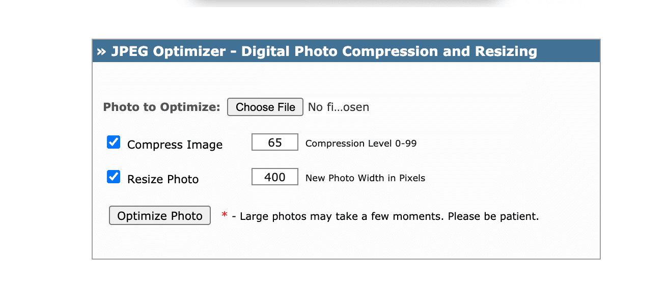
If you’re not using word-press and don’t have access to plug-ins like Smush Pro or WP Rocket, consider doing your compression before uploading photos onto your blogger website.
you can use sites like:

Site Link: Tinypng

Site Link: optimizilla

Site Link: jpeg-optimizer
7. Show Real People

Do you have a team behind the work that is being shown?
Catch them in action while doing their work and incorporate them into your overall brand image.
Show pictures of the people that participated in online content creation, so readers know precisely who’s speaking and how to take the tone as they move throughout the article.
People love talking and being around other people; it’s that simple.
By showing real people behind your business’s content, your brand comes off as more personable and trustworthy.
Show the people behind the scenes.
Make it seem as if your business isn’t some giant conglomerate with no face to the name.
Make it so people can relate faces to the brand image.
Build trust by showing that you are an actual human being with a pulse instead of a machine, and people will want to do business with you.
8. Use Images To Point Toward Important Content

Most likely, parts of your website are designed to collect information like emails or contact information as part of a lead generation process.
Studies have shown that when you point people in the right direction of what you want them to do, the likelihood of taking goes up drastically.
Use pictures and graphics on pages like this or just in sections of the website that you won’t be able to take action on to help guide the decision in the direction that you would like it to go.
Maybe use an arrow or someone pointing towards the section that you want them to look at.
Images and icons are a great way to get people to take action in a more natural tone.
9. Pictures Help People Remember What Is Being Taught

We’ve said this a few times now, but people think in images and experiences.
Unless the content on your website triggers a reader’s imagination, either from the story being told or the images you present, you will not be remembered for more than 10 minutes.
When people read books, they’re looking for the adventure and the story behind the words themselves to get lost in their minds.
Associate the things you are writing about with images that will help trigger an emotional state in someone’s mind, causing them to remember exactly what you were saying and the presented information.
Create a remarkable and memorable story that encapsulates the message you are trying to get into your readers’ minds.
Everyone loves a good story!
The more out of the ordinary the picture you paint, the more likely they will remember what you’re talking about.
Conclusion
Involving images in the content you create helps connect the dots in people’s minds and helps them recall more of what they have learned.
Plus, it raises the chance that your visitor will better recall your brand for the future when they want to learn more about your area of expertise.
Switch things up using GIFs or infographics to present the information differently and help people digest information more efficiently.
Instead of sticking to that old boring routine of creating boring, unengaging walls of text and calling it a day, you will be building more trust by resonating with your readers on a deeper level with more engaging imagery-filled content.
Pictures and images that correlate with the subject at hand with whatever you’re talking about create an emotional connection with your reader and greatly enhance the chance they will stay and learn more from you.
Thank you for hanging out with us today; as always, we appreciate you!
If you enjoyed this article and would like updates when we drop more just like it, subscribe to our email newsletter below!


0 Comments